真的有这么丝滑吗?MotionLayout + ViewDragHelper绝赞组合!

MotionLayout + ViewDragHelper 绝赞组合!
内容可能存在错误或疏漏,欢迎批评斧正…
前言
目前各大视频、音乐播放器都有小窗(折叠)和全屏(展开)模式。但是对我而言,一直没找到任何一个产品能完美地通过用户交互在这两个模式之间优雅地过渡,唯一差强人意的是YouTube移动客户端。但是它对用户手指松开后的动画处理仍然不够自然。所以我思考着能不能自己实现一个。
效果预览
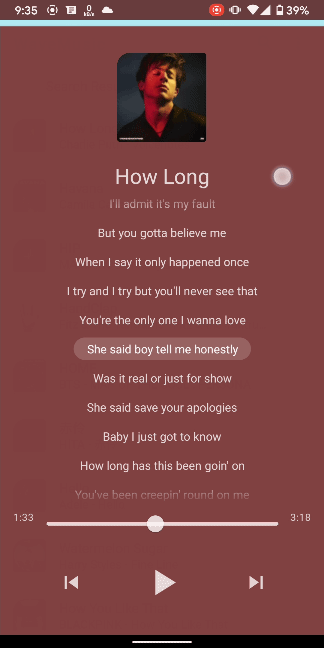
上面时我实现后的成品,展示了一个可根据用户拖动而在小窗和全屏之间过渡的音乐播放器。可以看到,无论是交互还是动画,都非常自然,也没有过度设计导致的低效。
需求实现分析
对于这样的需求,我首先想到的就是使用ViewDragHelper,因为它可以自然地处理手势拖拽。然后根据拖拽的比例设置控件的属性从而实现动画效果。但是这个界面上控件如此之多,其位置、大小、透明度、颜色、可见性乃至圆角大小都在变化,且不考虑工作量问题,就算实现了可维护性也非常糟糕。如果中途需求更改,某处要添加、移除一个控件,或者更换某个控件的动画效果,都是会牵一发而动全身的。这就是我们为什么要引入MotionLayout,因为它可以声明式地实现两个布局之间的过渡动画。其实,MotionLayout本身也可以通过<OnSwipe/>标签实现手势拖拽,但是效果真的差强人意,因为它无法实现像ViewDragHelper一样,当手指松开后,自然地过渡到结束状态。只有linear、accelerate、decelerate三种插值选项。所以我们还是使用ViewDragHelper处理手势。
MotionLayout简介
MotionLayout is intended to move, resize, and animate UI elements with which users interact, such as buttons and title bars. Motion in your app should not be simply a gratuitous special effect in your application. It should be used to help users understand what your application is doing.
MotionLayout是谷歌 I/O 2018引入Material Design 2后不久推出的旨在实现丝滑交互动画的布局组件。官方设计指南特别强调,MotionLayout的存在不是为了简单的动画特效,而是为了处理与User Interact相关的UI过渡。它对动画的实现完全是声明式的,即你只需要声明动画的开始、结束状态、关键帧等,而不需要考虑动画的具体实现。它还内置各种效果超赞的PathMotion和插值器,Android Studio还提供可视化编辑器的支持(实际体验并不是很友好)。那么,这么强大的东西学习成本是不是很高?这里打个预防针,要实现我们的需求,并不需要对MotionLayout有深入的了解,掌握一些基础用法就足够了。
ViewDragHelper简介
ViewDragHelper年代可就久远了,早在支持库年代就有了,大约可以追溯到2015年,MD一代推出之后。它的作用就如它的名字一样,帮助实现控件拖拽,网上的教程也是多如牛毛。我们会在下面的代码中介绍如何使用这玩意儿,使用起来也并不复杂。
准备工作
首先在你的项目中引入:
// 内置ViewDragHelper
implementation 'androidx.appcompat:appcompat:1.2.0'
// 须2.0+版本,内置MotionLayout
implementation 'com.android.support.constraint:constraint-layout:2.0.4'
配置MotionLayout布局
首先,我们新建一个布局文件,命名为fragment_player.xml。为了解耦,我们使用Fragment,将播放器界面与主界面分开。打开此布局文件,可以看到默认根布局是ConstranitLayout,我们进入design模式,选中我们的根布局后单击鼠标右键。可以看到,有一个选项:Convert to MotionLayout:
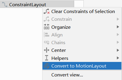
点击后,可以发现我们布局的根节点变成了MotionLayout,并且自动添加了一个app:layoutDescription属性,该属性指向了一个fragment_player_scene.xml文件。没错,这个文件就是用于声明动画的,点进去:
<?xml version="1.0" encoding="utf-8"?>
<MotionScene
    xmlns:android="http://schemas.android.com/apk/res/android"
    xmlns:motion="http://schemas.android.com/apk/res-auto">

    <Transition
        motion:constraintSetEnd="@+id/end"
        motion:constraintSetStart="@id/start"
        motion:duration="1000">
       <KeyFrameSet>
       </KeyFrameSet>
    </Transition>

    <ConstraintSet android:id="@+id/start">
    </ConstraintSet>

    <ConstraintSet android:id="@+id/end">
    </ConstraintSet>
</MotionScene>
其中Transition节点定义了过渡动画的起始场景、结束场景、关键帧等;ConstraintSet节点则用于存放视图约束条件,这是什么意思呢?往后看。
接下来,我们试着往MotionLayout中增加一个View,用作播放器的背景。等等,你是不是有疑惑,为什么背景不直接设置android:background属性在MotionLayout上呢?是这样的,因为MotionLayout只支持其直接子View进行动画,而MotionLayout本身要求高度为match_parent,我们才能实现全屏的效果。所以既要支持背景动画,又要保证能全屏,我们就需要使用一个View来作为背景。
<?xml version="1.0" encoding="utf-8"?><!--
  ~ Copyright (c) 2021 xjunz. All Rights Reserved.
  -->
<androidx.constraintlayout.motion.widget.MotionLayout xmlns:android="http://schemas.android.com/apk/res/android"
    xmlns:app="http://schemas.android.com/apk/res-auto"
    android:layout_width="match_parent"
    android:layout_height="match_parent"
    app:layoutDescription="@xml/sample_scene">

    <View
        android:id="@+id/player_background"
        android:background="#333"
        android:layout_width="wrap_content"
        android:layout_height="wrap_content" />
</androidx.constraintlayout.motion.widget.MotionLayout>
接下来,进入布局编辑器的design模式,可以看到MotionLayout的可视化编辑器,我们试着体验一下。
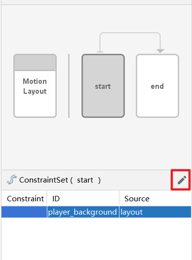
可以看到,右上有两个分别标着“start”和“end”的矩形页面,这就是我们fragment_player_scene.xml中定义的两个Transition节点的id。下方,可以编辑ConstrantSet。我们先选中”start“页面,再选中下方的player_background,然后点击红色方框中的按钮,选择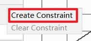
就可以在右侧工具栏像使用ConstraintLayout一样设置约束了。
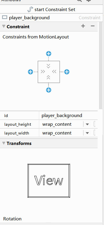
我们把背景约束到布局底部,然后宽度设为match_parent,高度设为?actionBarSize (Action Bar的高度)。
设置完之后,再查看XML代码,发现诶?好奇怪,怎么XML没变化?是的,与ConstraintLayout不同的是,对View设置的所有约束都需要在scene文件中定义,而不是在MotionLayout中定义,编辑器已经自动帮我们重定向到fragment_player_scene.xml了:
<?xml version="1.0" encoding="utf-8"?>
<MotionScene xmlns:android="http://schemas.android.com/apk/res/android"
    xmlns:motion="http://schemas.android.com/apk/res-auto">

    <Transition
        motion:constraintSetEnd="@+id/end"
        motion:constraintSetStart="@id/start"
        motion:duration="1000">
        <KeyFrameSet>

        </KeyFrameSet>
    </Transition>

    <ConstraintSet android:id="@+id/start">
        <!-- 约束节点 -->
        <Constraint
            android:id="@+id/player_background"
            android:layout_width="match_parent"
            android:layout_height="?actionBarSize"
            motion:layout_constraintBottom_toBottomOf="parent" />
    </ConstraintSet>

    <ConstraintSet android:id="@+id/end">

    </ConstraintSet>
</MotionScene>
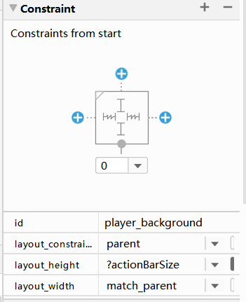
这样player_background的初始约束就完成了。同理,当我们选中“end”页面,再为其添加结束约束:
<?xml version="1.0" encoding="utf-8"?>
<MotionScene xmlns:android="http://schemas.android.com/apk/res/android"
    xmlns:motion="http://schemas.android.com/apk/res-auto">

    <Transition
        motion:constraintSetEnd="@+id/end"
        motion:constraintSetStart="@id/start"
        motion:duration="1000">
        <KeyFrameSet>

        </KeyFrameSet>
    </Transition>

    <ConstraintSet android:id="@+id/start">
        <Constraint
            android:id="@+id/player_background"
            android:layout_width="match_parent"
            android:layout_height="?actionBarSize"
            motion:layout_constraintBottom_toBottomOf="parent" />
    </ConstraintSet>

    <ConstraintSet android:id="@+id/end">
        <Constraint
            android:id="@+id/player_background"
            android:layout_width="match_parent"
            android:layout_height="wrap_content"
            motion:layout_constraintTop_toTopOf="parent"
            motion:layout_constraintBottom_toBottomOf="parent" />
    </ConstraintSet>
</MotionScene>
此时回到可视化编辑器:
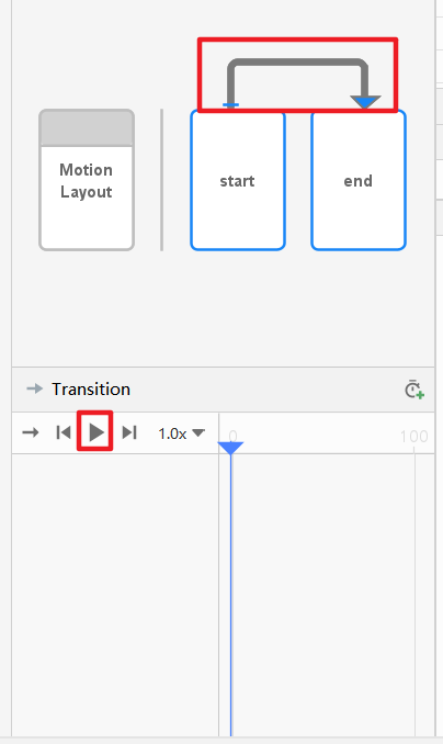
先点击上方红色框部分,再点击播放按钮,就可以预览我们的动画了!
除了约束可以被动画以外,我们还可以设置各种transform属性:
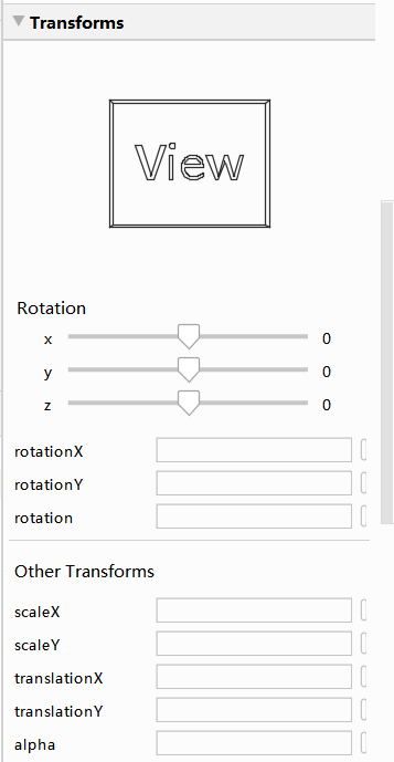
甚至是可见性visibility,MotionLayout也会自动使用透明度动画来过渡。除此之外,还支持View Transition属性,和自定义Attributes:
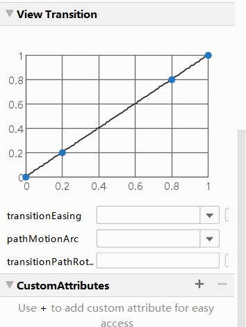
这些用法可以参考官方文档或网上的博文,本人不再赘述,因为这不是重点。
现在如果你在Transition节点下使用OnSwipe标签:
<MotionScene xmlns:android="http://schemas.android.com/apk/res/android"
    xmlns:motion="http://schemas.android.com/apk/res-auto">

    <Transition
        motion:constraintSetEnd="@+id/end"
        motion:constraintSetStart="@id/start"
        motion:duration="1000">
        <OnSwipe
            motion:dragDirection="dragUp"
            motion:touchAnchorId="@id/player_background"
            motion:touchAnchorSide="top" />
    </Transition>
    ...
</MotionScene>
就可以在“start”和“end”约束之间拖动player_background。但是如我前面所言,MotionLayout自带的拖动释放效果非常拉跨,我们需要使用ViewDagHelper来配合。
使用ViewDragHelper
新建一个类PlayerLayout,继承自MotionLayout,并在其中初始化ViewDragHelper:
public class PlayerLayout extends MotionLayout {
    private ViewDragHelper mHelper;
    private ViewDragHelper.Callback mCallback;
    /**
     * Background view
     */
    private View mBackground;
    /**
     * Background view在折叠时候的Top
     */
    private int mTopWhenCollapsed;
    /**
     * Background view在折叠时候的高度
     */
    private int mHeightWhenCollapsed;


    public PlayerLayout(@NonNull Context context, @Nullable AttributeSet attrs) {
        super(context, attrs);
        init();
    }

    public PlayerLayout(@NonNull Context context) {
        super(context);
        init();
    }

    public PlayerLayout(@NonNull Context context, @Nullable AttributeSet attrs, int defStyleAttr) {
        super(context, attrs, defStyleAttr);
        init();
    }

    private void init() {
        mHelper = ViewDragHelper.create(this, mCallback);
        OneShotPreDrawListener.add(this, () -> {
            // 在这里获取Top和Height
            mTopWhenCollapsed = mBackground.getTop();
            mHeightWhenCollapsed = mBackground.getHeight();
        });
    }

     @Override
    protected void onSizeChanged(int w, int h, int oldw, int oldh) {
        super.onSizeChanged(w, h, oldw, oldh);
        // 当布局大小改变时(如软键盘弹起),更新Top
        mTopWhenCollapsed = h - mHeightWhenCollapsed;
    }

    @Override
    protected void onFinishInflate() {
        super.onFinishInflate();
        mBackground = findViewById(R.id.player_background);
    }


    @Override
    public boolean onInterceptTouchEvent(@NotNull MotionEvent event) {
        // 让Helper判断是否应该切断事件
        return mHelper.shouldInterceptTouchEvent(event);
    }

    @SuppressLint("ClickableViewAccessibility")
    @Override
    public boolean onTouchEvent(@NotNull MotionEvent event) {
        // 这里判断一下Helper是否处于拖拽状态,拖拽状态就返回true消耗掉
        // 不是的话将事件传递下去交给其他View处理,否则MotionLayout会
        // block掉整个屏幕的触摸事件
        mHelper.processTouchEvent(event);
        boolean block = mHelper.getCapturedView() != null;
        // 拖动的时候禁止打断(ACTION_CANCEL)
        requestDisallowInterceptTouchEvent(block);
        return block;
    }
}
上面很多代码是ViewDragHelper固定的用法,有不懂的可以看注释。mTopWhenCollapsed后面会用到。我们还有一个mCallback变量未初始化,因为这个比较重要,单独拿出来:
mCallback = new ViewDragHelper.Callback() {

    @Override
    public boolean tryCaptureView(@NonNull View child, int pointerId) {
        // 在这里定义允许哪个子视图拖动
        // 我们允许MotionLayout中的所有子视图拖动
        return true;
    }

    @Override
    public void onViewCaptured(@NonNull View capturedChild, int activePointerId) {
        super.onViewCaptured(capturedChild, activePointerId);
        try {
            // 因为MotionLayout只支持其直接子视图的动画,而我们需要允许所有子视图拖动
            // 这样的话,就需要处理非常多的View的拖动,因此重定向我们的'mCapturedChild'
            // 到Background view, 这样就只要处理一个View就够了
            Field capturedViewField = mHelper.getClass().getDeclaredField("mCapturedView");
            capturedViewField.setAccessible(true);
            capturedViewField.set(mHelper, mBackground);
        } catch (NoSuchFieldException | IllegalAccessException e) {
            // Ho hum
        }
    }

    @Override
    public void onViewPositionChanged(@NonNull View changedView, int left, int top, int dx, int dy) {
        super.onViewPositionChanged(changedView, left, top, dx, dy);
        if (dy == 0) {
            return;
        }
        // 当Background view拖动位置改变时,我们获取其拖动的百分比
        // mTopWhenCollapsed就是能拖动的总距离
        float fraction = 1 - mBackground.getTop() / (float) mTopWhenCollapsed;//from 0 to 1
        // 在这里根据拖动的百分比设置动画进度
        setProgress(fraction);
    }

    @Override
    public void onViewReleased(@NonNull View releasedChild, float xvel, float yvel) {
        // 当手指松开取消拖动时
        super.onViewReleased(releasedChild, xvel, yvel);
        // 根据Background view的速度、位置分别处理打开还是关闭Player
        if (yvel > 0) {
            collapsePlayer();
        } else if (yvel < 0) {
            expandPlayer();
        } else {
            if (releasedChild.getTop() / (float) mTopWhenCollapsed > .5f) {
                collapsePlayer();
            } else {
                expandPlayer();
            }
        }
    }

    @Override
    public int getViewVerticalDragRange(@NonNull View child) {
        // 返回Background view所能垂直拖动的距离
        return mTopWhenCollapsed;
    }

    @Override
    public int clampViewPositionVertical(@NonNull View child, int top, int dy) {
        // 约束Background view在拖动中垂直方向上所允许Top范围
        // 返回值约束在0和mTopWhenCollapsed之间
        return Math.min(Math.max(0, top), mTopWhenCollapsed);
    }

    @Override
    public int clampViewPositionHorizontal(@NonNull View child, int left, int dx) {
        // 水平方向自适应
        return child.getLeft();
    }
};
最后,是松手后实现自然折叠、展开的方法:
public void expandPlayer() {
    if (mHelper.smoothSlideViewTo(mBackground, 0, 0)) {
        ViewCompat.postInvalidateOnAnimation(this);
    }
}

public void collapsePlayer() {
    if (mHelper.smoothSlideViewTo(mBackground, 0, mTopWhenCollapsed)) {
        ViewCompat.postInvalidateOnAnimation(this);
    }
}

@Override
public void computeScroll() {
    if (mHelper.continueSettling(true)) {
        ViewCompat.postInvalidateOnAnimation(this);
    }
}
这样,就完成了最基本的框架就完成了,核心思想就是在ViewDragHelper.Callback中监听滑动的比例,然后为MotionLayout设置动画的比例,当然还有很多小细节的处理。预览图那样的效果不过是在此基础上增加了更多的view和动画。
其他冷知识
如何渐变圆角?
可以看到我们的预览图中,播放器折叠时左上角有圆角,但是随着滑动,圆角逐渐消失最终不见。这是如何实现的呢?
MaterialShapeDrawable
使用前先导入google的design库:
implementation 'com.google.android.material:material:1.2.1'
构造实例并使用:
// 构造左上角圆角的ShapeAppearanceModel
mDefShapeAppearance = ShapeAppearanceModel.builder().setTopLeftCorner(CornerFamily.ROUNDED, defCornerSize).build();
// 根据ShapeAppearanceModel初始化MaterialShapeDrawable
mBackgroundDrawable = new MaterialShapeDrawable(mDefShapeAppearance);
// 将此Drawable设为View的背景
view.setBackground(mBackgroundDrawable);
提供改变圆角的方法:
public void setTopLeftCornerSize(float cornerSize) {
  mBackgroundDrawable.setShapeAppearanceModel(mDefShapeAppearance.toBuilder().setTopLeftCorner(CornerFamily.ROUNDED, cornerSize).build());
}
Custom Attributes
如果想要MotionLayout自动在动画过程中改变圆角,而不用手动设置,可以使用上面提及的自定义属性。新建一个自定义View继承自你想设置圆角的那个View的类,然后把上面设置圆角的方法内置到该类中。
在编辑器中选中该view,在其约束编辑窗口中找到此按钮 然后会弹出此窗口:
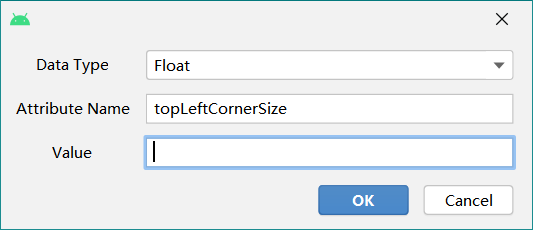
在“start”和“end”两个ConstranitSet中分别配置Value就行了。
如何渐变状态栏颜色?
// 前提是windowTranslucentStatus = false且windowDrawsSystemBarBackgrounds = true
ObjectAnimator.ofArgb(activity.getWindow(), "statusBarColor", customColor);
本作品采用知识共享署名-非商业性使用-相同方式共享 4.0 国际许可协议进行许可。
本文链接:http://www.xjunz.top/post/MotionLayout+ViewDragHelper/
